The photos I took feature people interacting with objects rather than a normal portrait picture. The three different pictures are all differently set up with the lighting. The picture with the white backdrop has a lot of natural light and looks very calm. The black backdrop is a very focused direct light to make Ian really stand out to the rest of the picture. The picture with the grey backdrop has a light that is on Kara's left hand side that sort of gets a cross light look. The uneveness of the lighting is the main focus of the picture. The mood set by the white backdrop is calm and smooth. The grey backdrop is sort of mysterious. The black backdrop is sharp and very percise. Maybe emphasize it more. Maybe put some gels on the lenses to get a better look. The gels can really change the mood of a photo.
Greatest Hits
1. I like this photo because of the darkness of the Jump Man on the shoe. I like it because its like a darkness with another darkness. The texture of the composite leather is really cool. I used a shallow depth of field when i took this photo.
2. I like the mantis because its a weird looking bug. I like the texture on the claws of the mantis. I like how the front of the mantis is in focus, on his head mainly, but the rest of his body is not. I used depth of field for this effect.
3. This photo got distorted. I like the photo more before this happened.
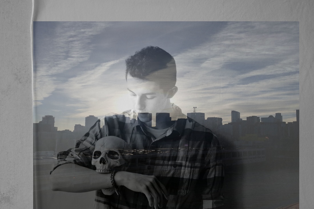
I chose the portrait photo because its my best portrait photo. I combined it with the picture of the sky because it gave the photo a harmonic feel. I feel like the sky is the best part of the image. If I could touch up one part of the image i would touch the part where Steve and the buildings combine.
